Designer Spotlight: Studio Gild
Kristen Ekeland, Melissa Benham, and Jennie Bishop are the creative dream team behind Studio Gild, a design firm based out of Chicago and Los Angeles with styles rooted in clean architecture and subtle beauty. The team featured my art in two major projects (one of which was recently featured in Domino Magazine — woah!), and with Studio Gild’s designs being featured everywhere from New York City to Denver, there’s no stopping this company’s ever growing success.
With the upcoming launch of my newest collection, it felt like the perfect time to reflect on past works. Naturally, I thought these talented ladies were the perfect fit for this month’s Designer Spotlight. The Lauren Williams team spoke with the three founders to learn more about their design process, what they’ve learned as industry veterans, and Studio Gild’s journey since its inception. Needless to say, get ready to be just as obsessed with them as I am!
Left to right: Kristen Ekeland, Jennie Bishop, and Melissa Benham; Photo credit: Erika Dufour Photography
Tell us about Studio Gild! What's your mission and how long have you been in business?
Kristen Ekeland: We co-founded Studio Gild in 2014 with a shared love of clean architecture and subtle beauty. As a whole, we draw on our experience in residential, hospitality, retail and commercial design to deliver elevated interiors, foster unique collaborations with artisans and maintain strong client relationships.
Jennie Bishop: We pull our inspiration from fashion, art and architecture and infuse each project with a touch of sophisticated whimsy and endless style. Our overall mission is to create environments that are curated, provocative and timeless.
There are three founders in your firm. What led the three of you to form Studio Gild?
Melissa Behnham: Our former jobs gave us a number of opportunities to work with one another on a wide variety of design projects. Collaborating in this way allowed us to draw upon each other’s creativity and expertise and we realized we have a formula that works! As each of us moved on in our careers, forming a partnership was a natural fit.
Photo credit: Michael Schwartz Photography
How would you describe Studio Gild’s design aesthetic or signature style that differentiates you from other firms?
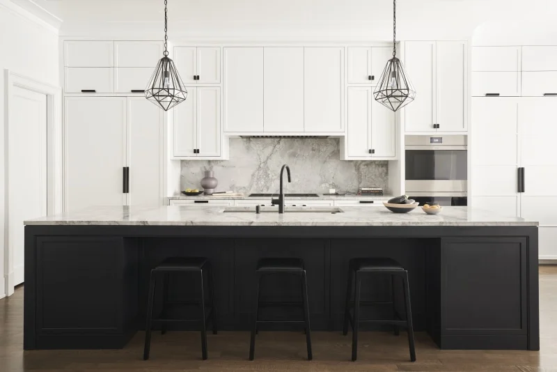
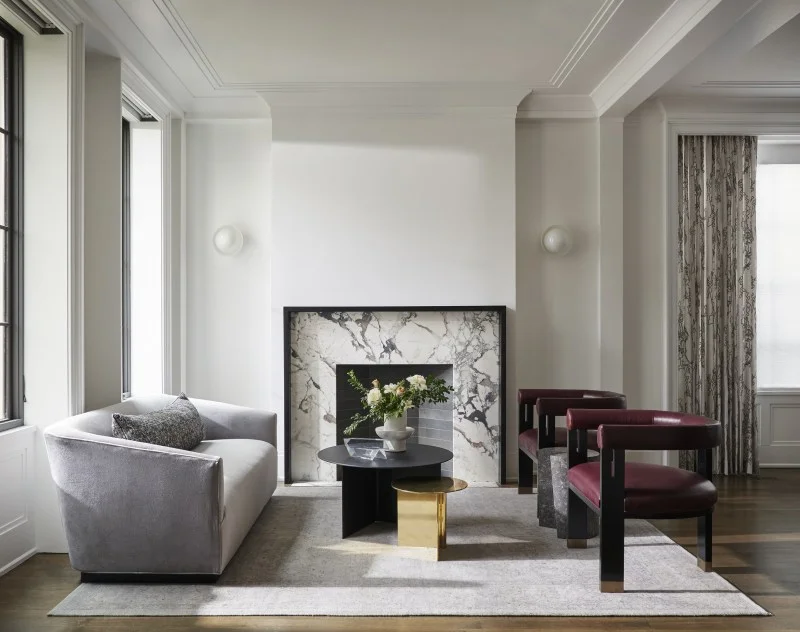
MB: We pride ourselves on having strong collaborative relationships with our clients, resulting in interiors that are eclectic with an authentic point of view and without a singular aesthetic -- the common thread is a fine layer of thoughtful detail.
Photo credit: Michael Schwartz Photography
Photo credit: Studio Guild
Photo credit: Barnes & Noble
Your firm draws inspiration from fashion, art and architecture. If you had to choose one person who has inspired your design aesthetic the most, who would it be?
KE: Ilse Crawford. Her coffee table book not only proves how brilliantly she balances function with aesthetic to transform a room into an alluring yet comfortable space, but she shares so many pearls of wisdom on the profession of design and our responsibility as designers in this world.
What celebrity is your ideal client based on their style or personality? What about their style or personality would be the best part of working with them?
KE: Cate Blanchett. Aside from being in awe of her acting talent and natural beauty, her fashion sense is incredible and she’s not afraid to make a statement and be avant-garde. Any one of her red-carpet dresses could inspire a room design on its own. She clearly enjoys playing with color, texture and form in a way that is unique, but successful, and stands the test of time — which is our goal each time we approach a project.
What room is your favorite space to design? Why?
All: That’s easy, the powder room. It’s a small space where you get to make a big impact. The saying “go big or go home” is our motto for approaching the design for this space. Bold wallpaper, stunning sconces, gorgeous stone slab — a client can have it all in their powder room.
Photo credit: Michael Schwartz Photography
What has been the biggest challenge you’ve faced in the time Studio Gild has been in business, and what have you learned from overcoming that challenge?
KE: Learning how to provide the work/life balance we strongly believe in while still running an efficient design firm. What we’ve learned in the last 5+ years is that being open minded and flexible helps foster successful ways to run a company that may be different from what we experienced during our journey working for other firms. Not all work has to happen from 9-to-5 in an office setting, especially in a field that relies heavily on creativity. The more flexibility we have been able to give our employees, the happier they seem to be and better work product we receive.
What has been a highlight of your time working at Studio Gild?
MB: I think that I can speak for all three of us when I say our expansion to Los Angeles has been a huge highlight for us and for the firm. With two studio locales, we have a bigger bag of tricks, and synergies between the Chicago and Los Angeles teams contribute to exponentially more impactful work. Immersing ourselves in the LA design community, harnessing fresh inspiration and tapping into a different design aesthetic infuses and benefits both studios.
Photo credit: Michael Schwartz Photography
How do you approach sourcing artwork for your projects? (i.e., do you use word of mouth to find artists? Do your own research? Have an online resource?)
KE: We think art is such an important part of a home and relish the opportunity to collaborate with clients on collections for their own homes. When our schedules allow, we love attending art fairs such as Art Basel or Chicago Art Expo. We also think it’s important to support local artists and are grateful for the relationships we’ve built within our immediate community. These days we are fortunate that online sources such as Pinterest, Instagram, Etsy and Saatchi Art are such powerful resources for helping discover new artists and emerging talent when you don’t have time to venture out.
Photo credit: Michael Schwartz Photography
What are some things you look for in a piece when selecting artwork for a space?
JB: It really depends on the space. We’ve designed interiors where the artwork is the main focus and the surrounding furnishings and accessories stay neutral in order to allow the artwork to take centerstage. But we’ve also designed interiors where the artwork is an extension of the overall design and is selected to not only compliment the space, but tie all of the selections together to create a cohesive feel.
Photo credit: Michael Schwartz Photography
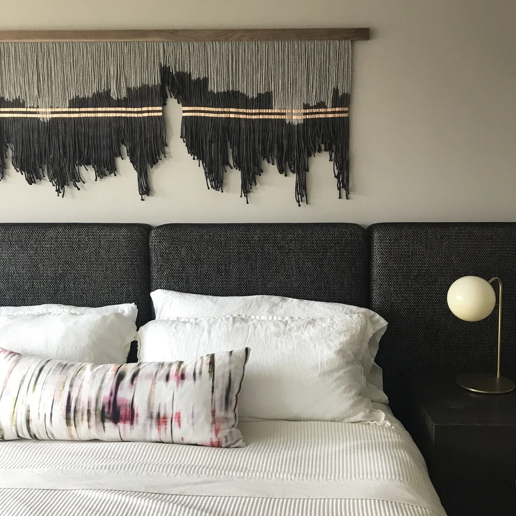
How does Lauren Williams ART + HOME fit in to your design aesthetic?
KE: Of the interiors that we have chosen to use Lauren’s artwork in, we’ve done so because we were needing a piece to add interest and originality. Lauren’s work provides a layer of detail, dimension and movement that you wouldn’t get from a flat canvas.
What tips or advice do you have for businesses or designs new to the industry?
JB: Start building your network and making connections. The design industry is a small one, so developing a good reputation amongst your peers will only be beneficial to you.
You can follow Studio Gild’s work on Instagram, Twitter and Facebook and get some major inspiration on the firm’s Pinterest and Houzz pages.
Don’t miss Lauren’s next collection release on September 7. CLICK TO SHOP EARLY!


