Designer Spotlight: Lisa Furtado Interiors
When I sold my first piece of artwork, I was a mother of two, working with my husband to build a film production company. We worked with small businesses and advertising agencies to create commercials and online brand content. We loved working with entrepreneurs to tell their story and appeal to their audience. This was a very helpful skill when I started to create artwork as a side hustle in the evenings and during nap times. I created a piece of art for an empty wall in our dining room and shared it to Instagram. Friends and friends of friends began asking if I would make them a piece. I would use my phone to photograph different parts of my process and film videos to further the message I wanted my artwork to convey.
Outside of creating the artwork itself, the “marketing of my artwork” was another creative outlet that I have continued to love as part of my business. When my third baby was born, I was home with the kids full-time and filled with so much creative energy. During this precious time, I was able to really see how much I needed to create as an outlet and form of identity.
I am so thrilled to share a similar story of a woman who I have had the pleasure of working with in her own creative outlet. Lisa Furtado is an interior designer who has included my artwork in her award winning projects and also her own home. The story of Lisa Furtado and her design firm is inspiring (I mean, her FIRST kitchen design ended up on the cover of Home Beautiful!) I hope you enjoy getting to know this talented woman as much as I have! -LW
Lisa, thank you so much for being a part of our Design Spotlight series. Tell us about your firm and how you came to be an interior designer.
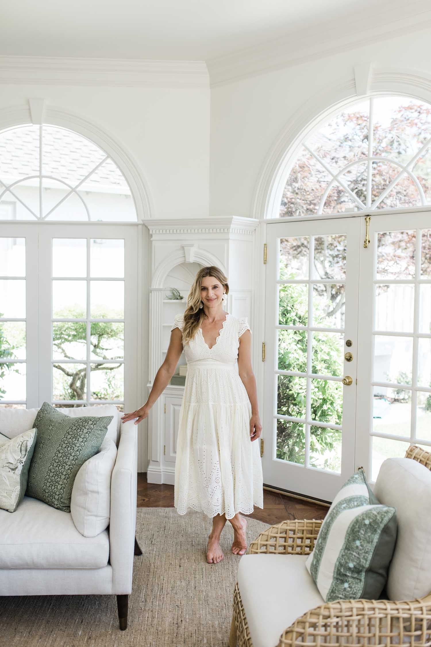
Lisa Furtado of Lisa Furtado Interiors // Photo: Madeline Harper
Your first crush is hard to shake. I guess I never really got over mine. After various scientific degrees and a successful career in biotech, my creative itch never let up. While on maternity leave with my third child, I took an interior design course that rekindled a flame that lay idle behind beakers and boardrooms for years. Of course it wasn’t an easy decision, but within a few months I quit my job, enrolled in design school and never looked back.
My interest in decorative arts and design was always present, although early in life I didn’t recognize it as such. Looking back, there were many signs.
While watching my kids play one day with some old toys in my mom’s garage, I pulled out my old dollhouse: a beautiful, wood constructed Victorian that brought back many childhood memories. My mom and I laughed as we explored room by room, each meticulously decorated with carpet remnants, tile samples, wall paper cut outs, and tiny handmade throw pillows. Not a single doll inhabited that house, but it provided hours of entertainment as a kid.
Perhaps I should have caught on my first day of college when I was much more excited about decorating my dorm room than doing anything else. During graduate school in Boston I lived with a group of friends in a Back Bay brownstone. We could barely afford the rent but we couldn't pass up this apartment that was rich in history and brimming with character. When I should have had my head deep in my biochemistry book, I found myself staring up longingly at the hand carved acanthus leaves on the crown molding perched 30 feet above.
I certainly don’t regret taking the long road to land in this business. My first career taught me to lead teams, manage vendors, navigate different personalities and most importantly to be resourceful. I was able to travel to some of the most amazing cities in the world from Cape Town to Istanbul whose architecture and landscape would later be used as design inspiration. With this background, I offer a balance of creativity, collaboration, and forward thinking that is essential to designing homes that nurture and support clients' lives.
Starting an interior design business is a homecoming of sorts. It marks the official start of a love affair with my first crush, a creative passion that has stood the test of time. So, make room design industry. I’m pulling up a chair (an Eames Lounge, please) and staying a while.
“I may be a late starter in the industry but at this point in my life I bring quite a bit of street cred. As a mom of three, I understand the importance of a well-constructed sofa frame to withstand body slamming and dance parties. I consider myself an authority on wear and tear and know the value of a great performance fabric to prevent wine stains ;)”
Design: Lisa Furtado Interiors // Photo: SEN Creative
How would you define your design style? Does that have to be adapted based on your clients?
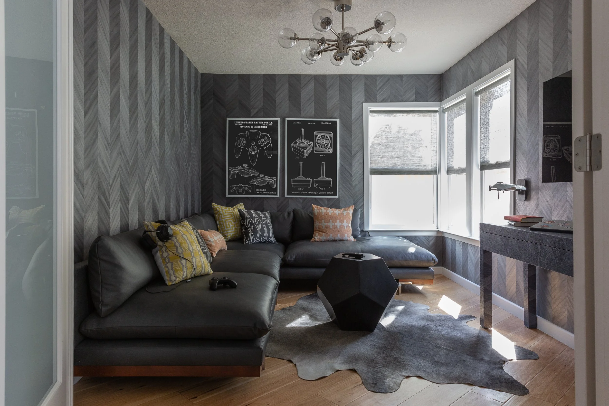
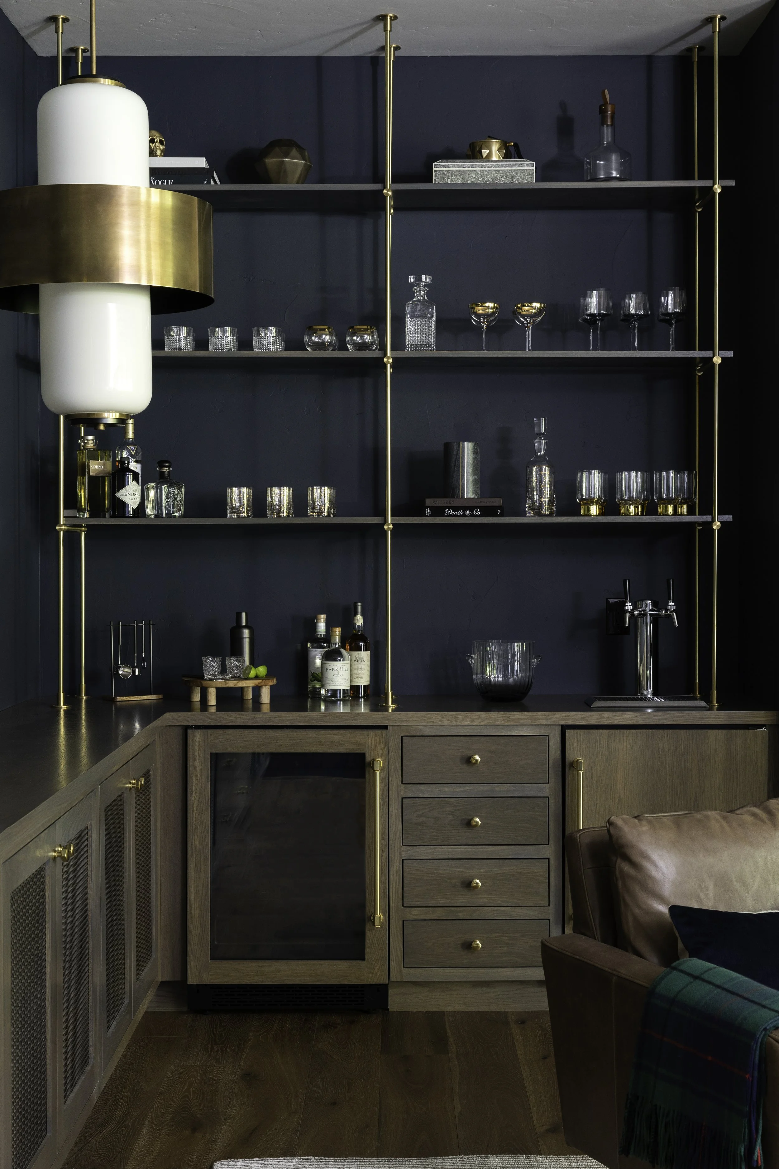
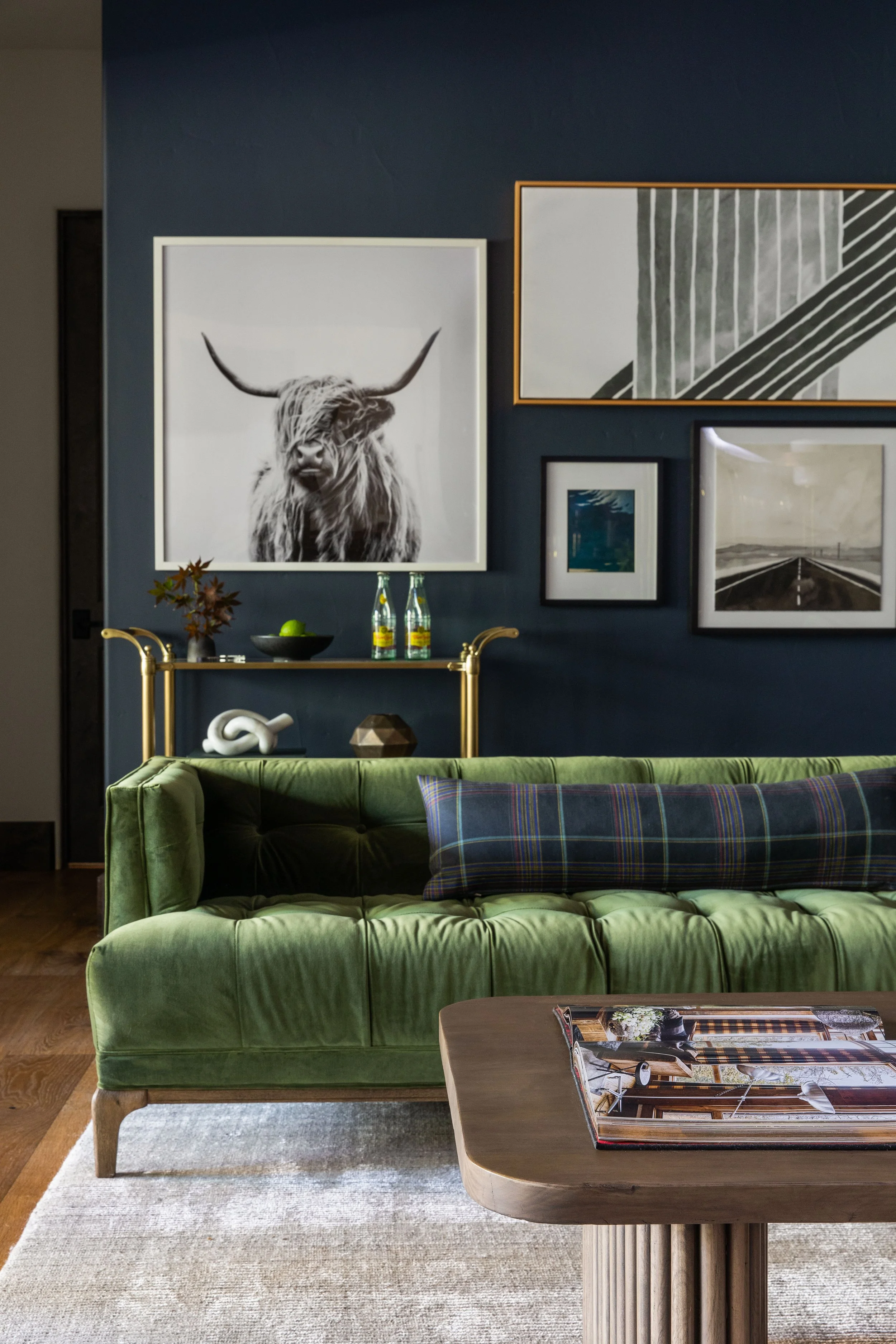
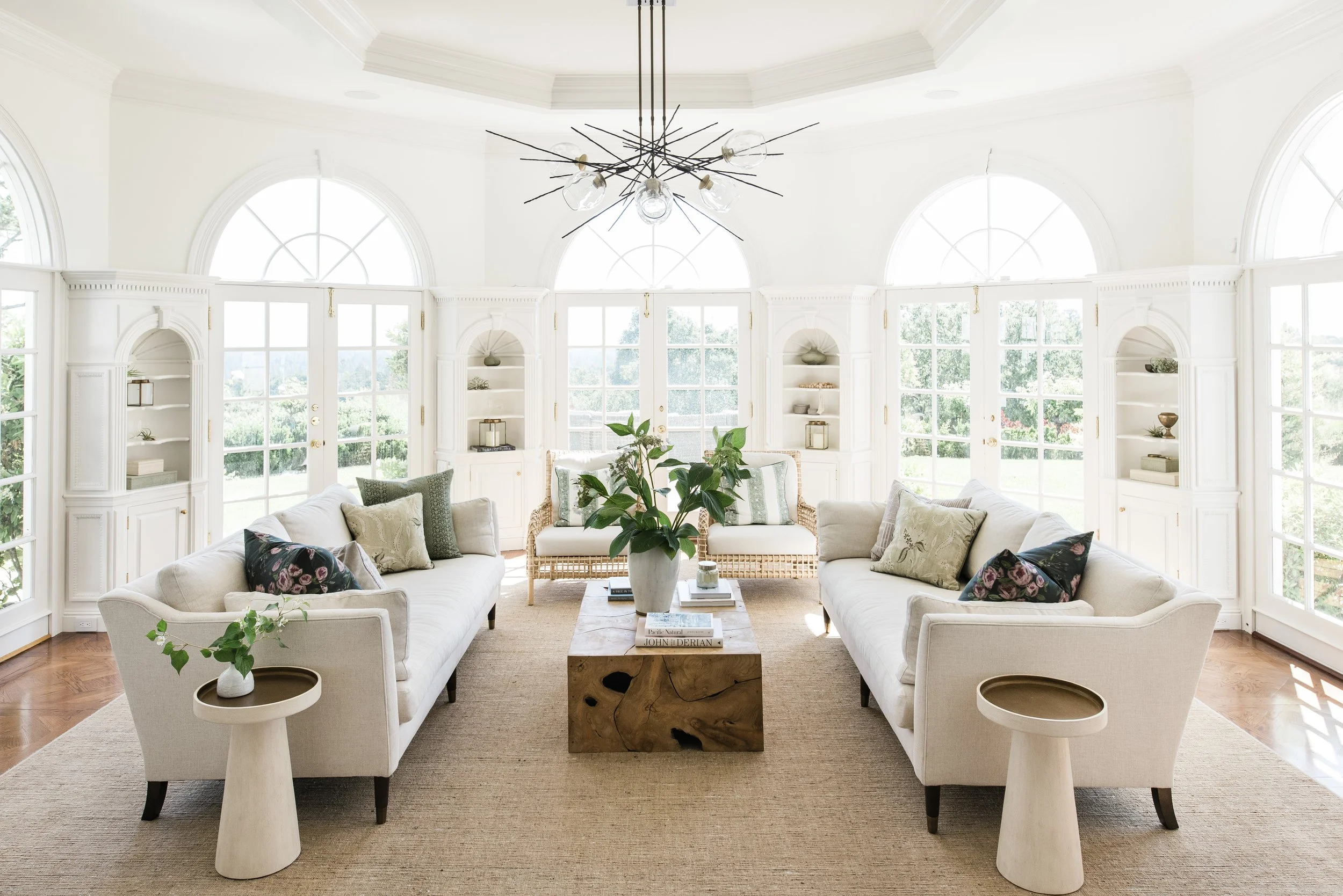
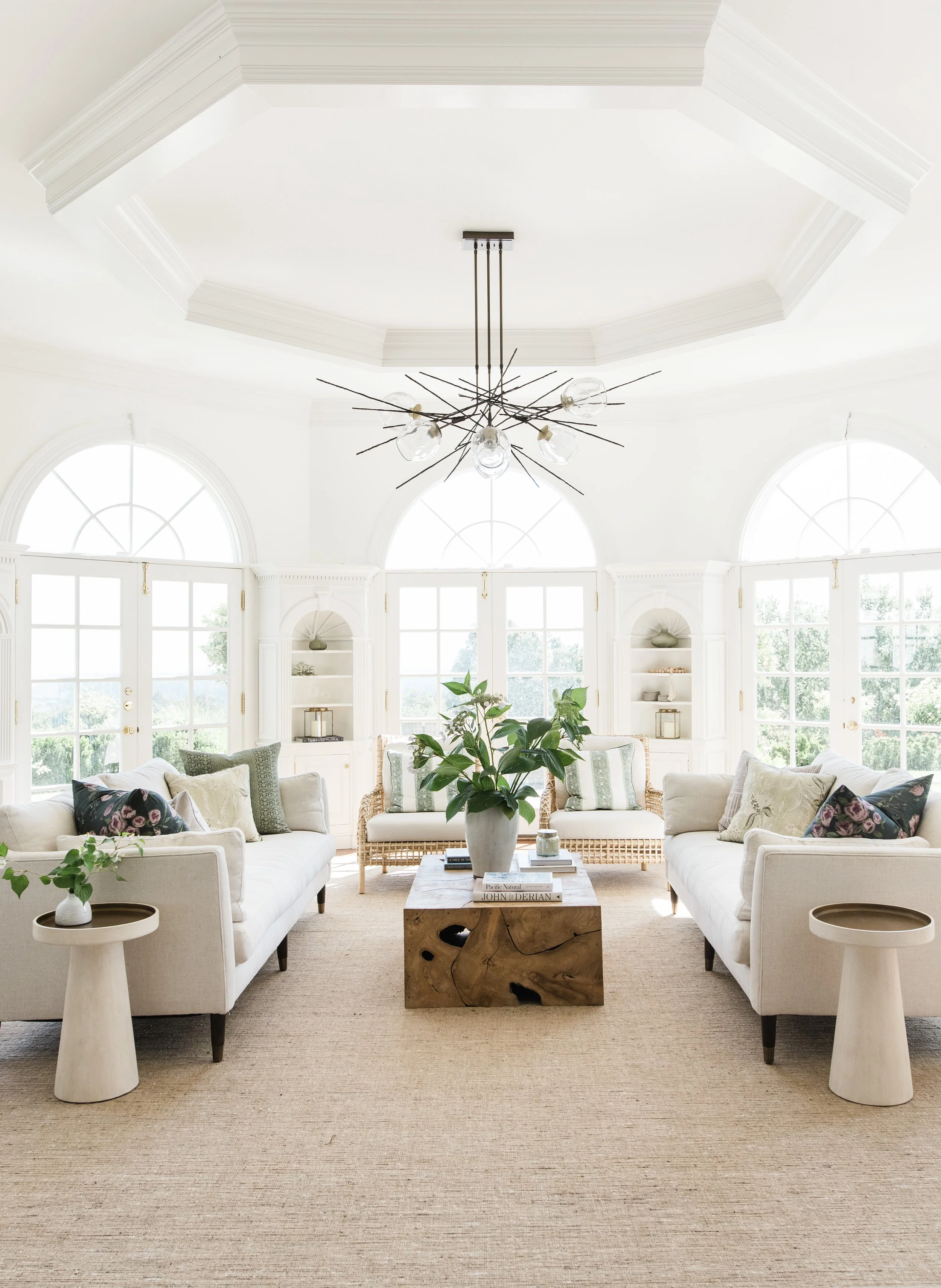
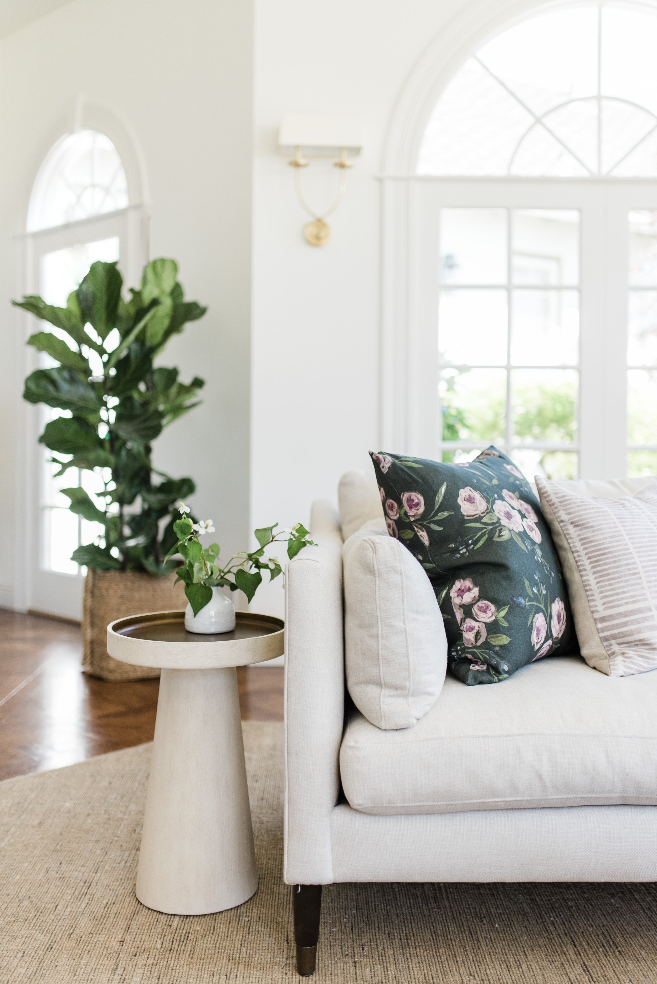
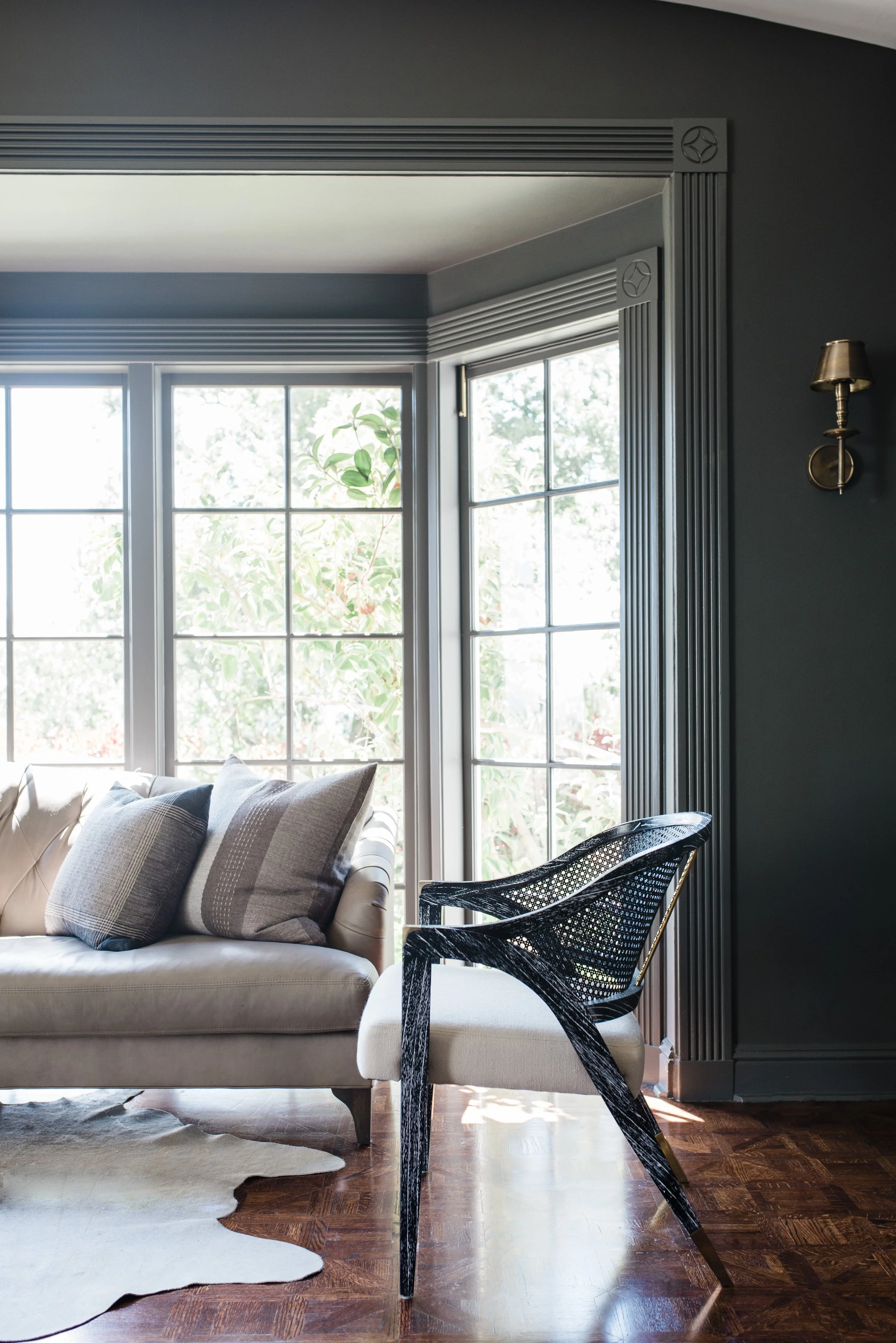
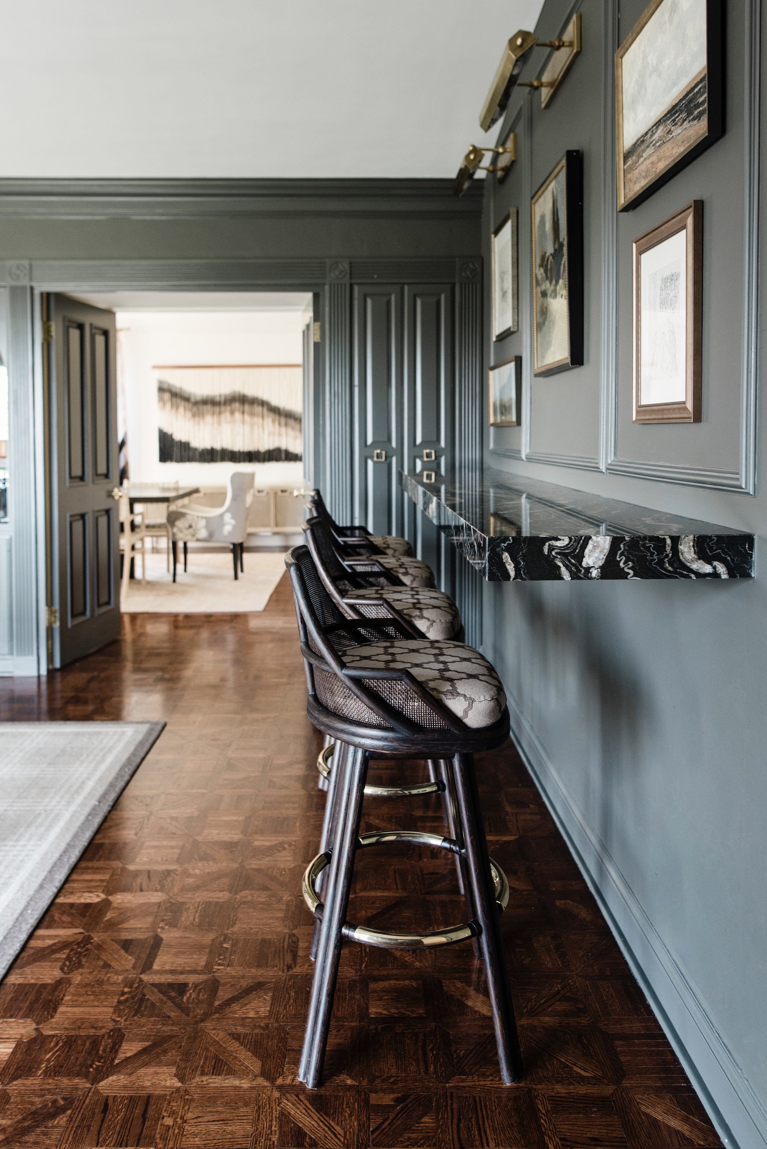
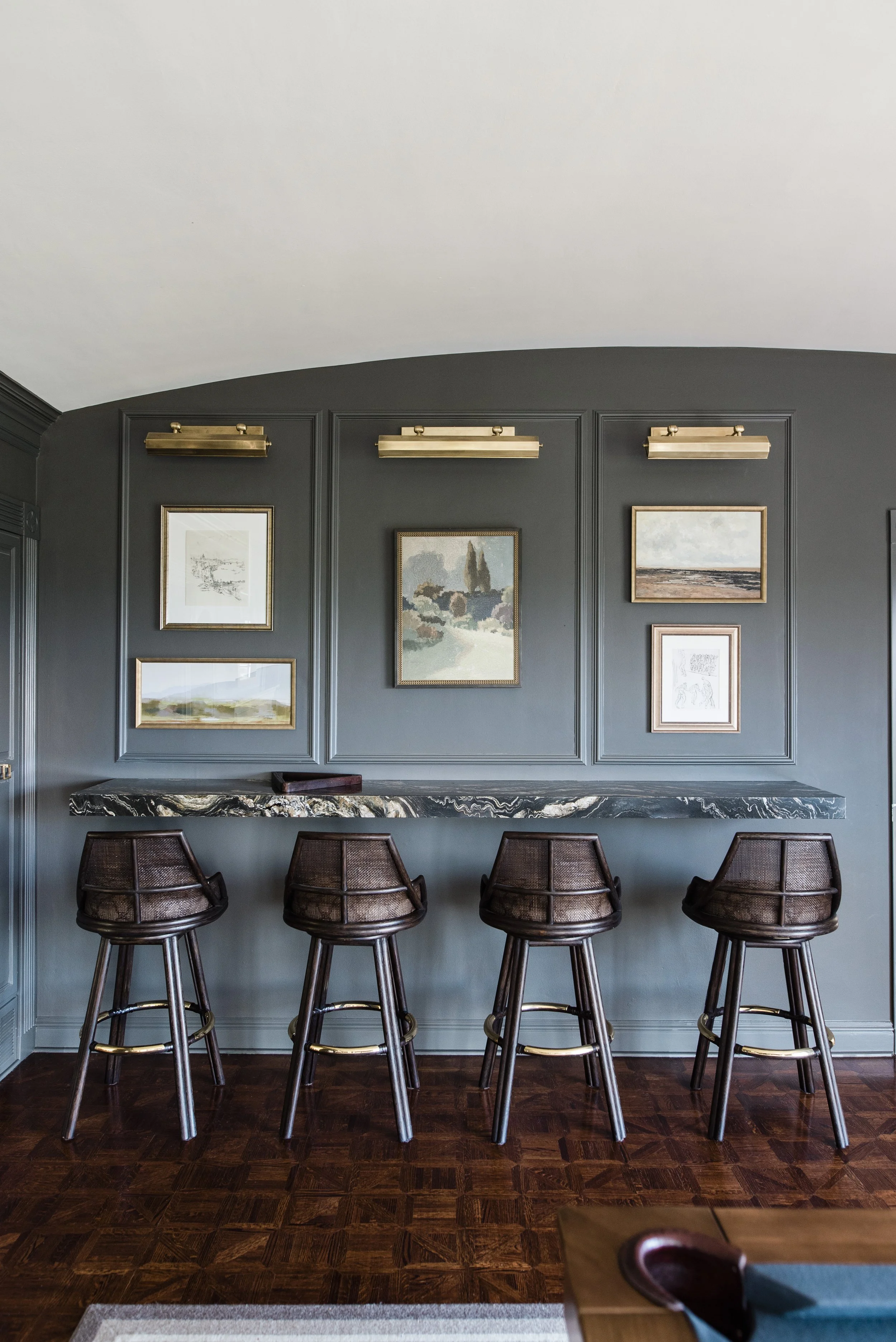
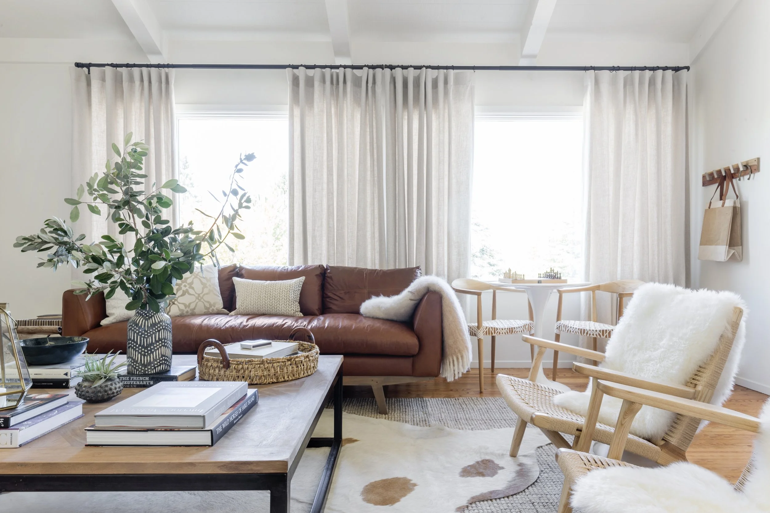
I describe my style as traditionally rooted with a modern edge. I love layering pieces with historical reference alongside modern, unexpected elements to create beautifully curated spaces that tell the story of a homeowner. I love a refined, classic interior with a little bit of tension and a sprinkle of controversy. If everyone out there loves it, I’ve played it too safe.
Design: Lisa Furtado Interiors // Photo: Madeline Harper
Design: Lisa Furtado Interiors // Photo: Madeline Harper
Design: Lisa Furtado Interiors // Photo: Madeline Harper
You work in the Bay Area and beyond. How do you draw inspiration from the area?
Living in the SF Bay Area, we are fortunate to live in a place where nature continually inspires, from the beach to the mountains to wine country. I also love studying furniture and interiors from the past. I also get inspiration and motivation from my clients who all live very different lifestyles and have different family dynamics. Finding creative solutions that allow each family to live comfortably and beautifully brings me a lot of joy. They are the reason we do what we do.
Design: Lisa Furtado Interiors // Photo: Nicole Dianne
“When I quit my job to stay home with my kids, I began casually designing spaces for friends and family for fun then kept being asked by friends of friends that had seen the spaces. I fell in love with the impact I could have on the way people live and the way they feel about their home.”
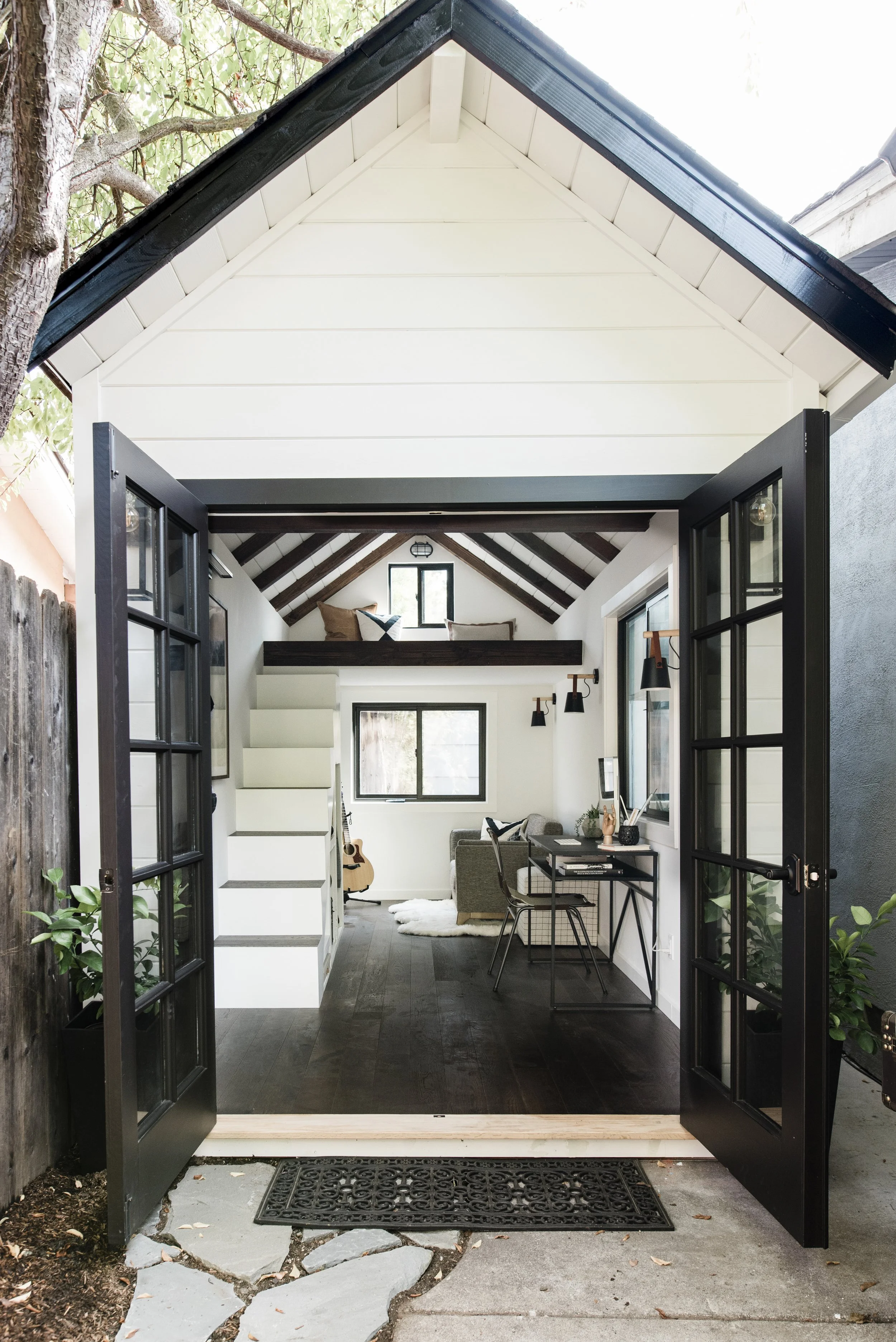
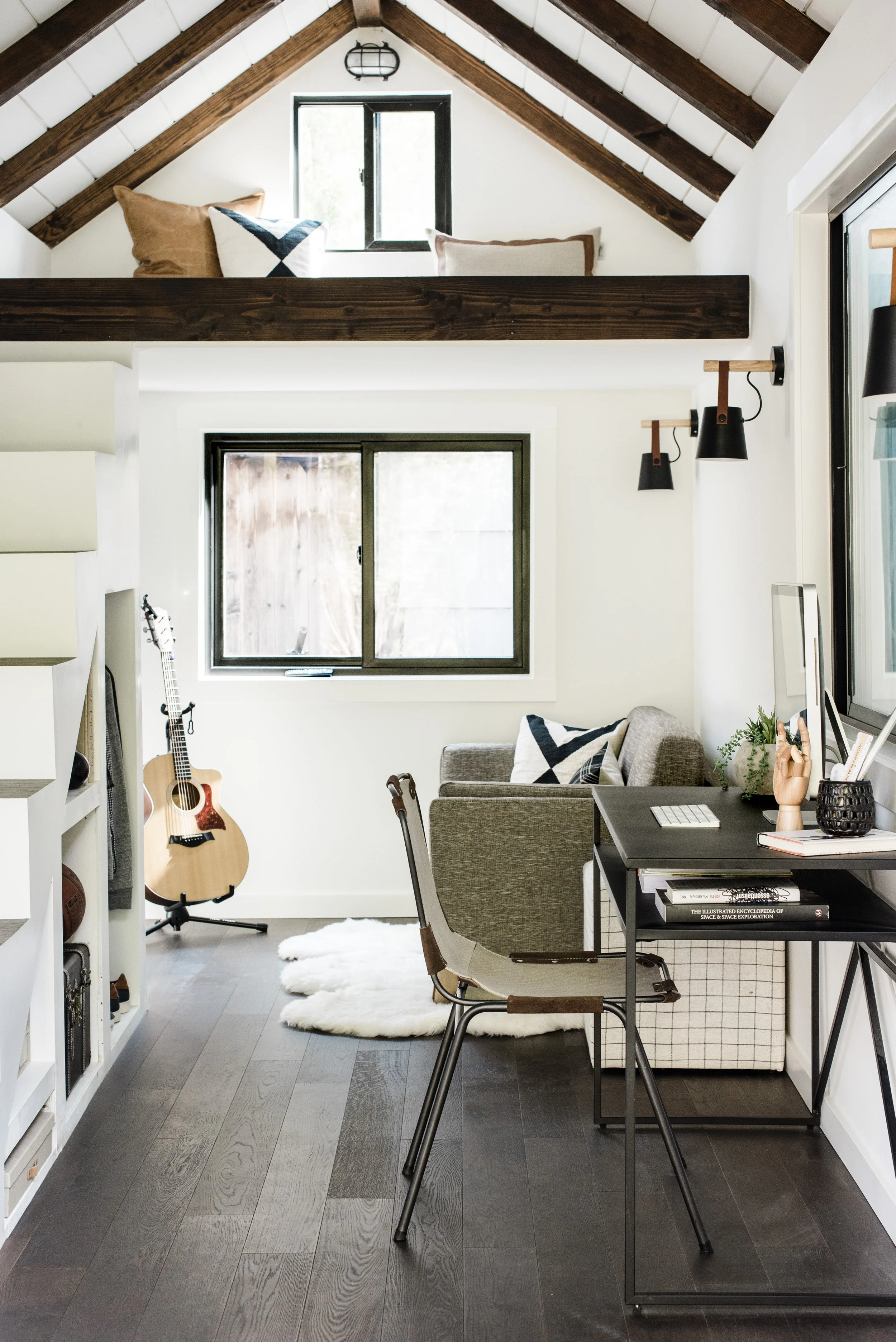
I loved the recent feature in Domino on the playhouse turned teen sanctuary you designed and created for your son during the pandemic. What was your biggest challenge in this project?
The biggest challenge of the “Teeny Tiny House” was the lack of materials available during the peak of the pandemic. We got scrappy and found used doors on Craigslist, painted Home Depot windows black and found left-over materials from various sources. The fortunate part was that we didn’t need much of anything since there was so little square footage. We also saved on labor since we told my son that if he wanted his own room he was going to have to help build it!
Design: Lisa Furtado Interiors // Photo: Madeline Harper
Design: Lisa Furtado Interiors // Photo: Madeline Harper
Design: Lisa Furtado Interiors // Photo: Vivian Johnson
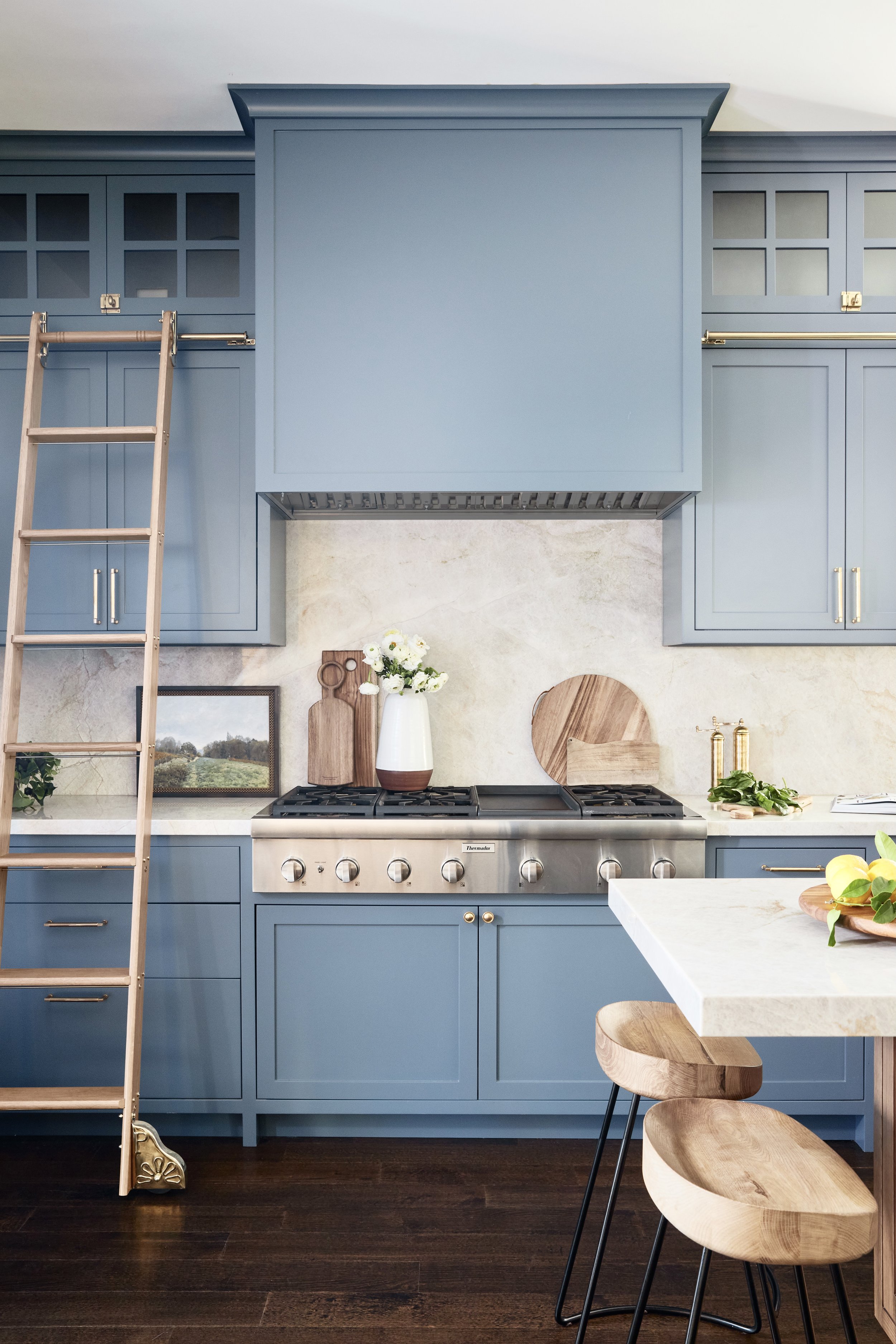
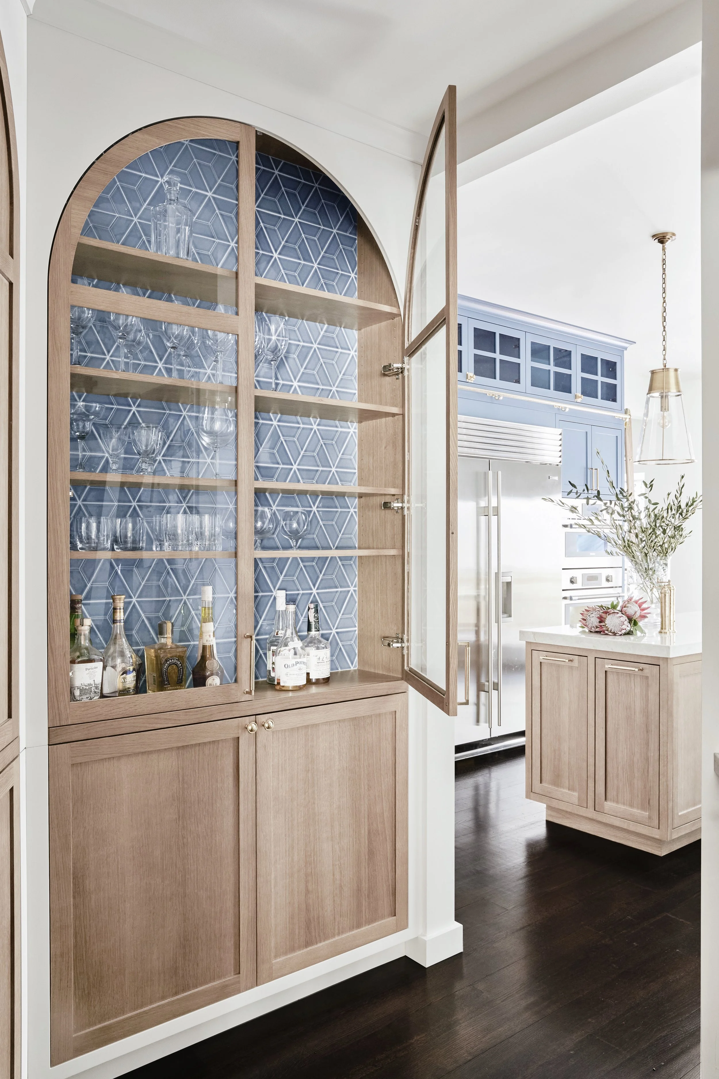
I cannot stop drooling over the kitchen you designed that was on the front page of Home Beautiful. From the color, to the arched bar cabinets, to the rolling ladder, it’s all gorgeous. What was your favorite moment when designing this space? Is the ladder functional or is it just a fun design element?
Thank you. It was actually the first kitchen I had ever designed! I guess sometimes not knowing the rules works in your favor. Of course, I did a lot of research to ensure that the kitchen functioned well. But I learned as I went and my clients were incredibly open to my not-so-typical design ideas as long as the kitchen was blue and gold (Michigan fans) and the result was a happy, family friendly space. My favorite moment is the arched built in bar cabinet we designed at the end of the row of arched panty doors. With the unique shape and tiles backing, it was definitely a show stopper.
Yes, the ladder is functional. Changing the footprint in this historic San Francisco house was not an option. We were working with a narrow kitchen with very high ceilings. We wanted to utilize all the vertical space we could with cabinetry, but it needed to be accessible. We installed a library ladder and a brass rail that runs the length of the kitchen on both sides. The ladder is taken out when they need to reach large platters or occasional pieces and is tucked away around the corner on a hook when not in use.
Design: Lisa Furtado Interiors // Photo: Vivian Johnson
Design: Lisa Furtado Interiors // Photo: Vivian Johnson
Your designs have such depth in the layering. Where do you start when designing and sourcing pieces for a new space?
I typically start with one or two furniture pieces, fabric or art that either I have found or a client loves and we build the room around them. I have literally designed a room based on a two-inch piece of fabric. With a jumping off point and a general sense of a client’s general design preferences, the layering comes easy.
Design: Lisa Furtado Interiors // Photo: Nicole Dianne
Design: Lisa Furtado Interiors // Photo: Nicole Dianne
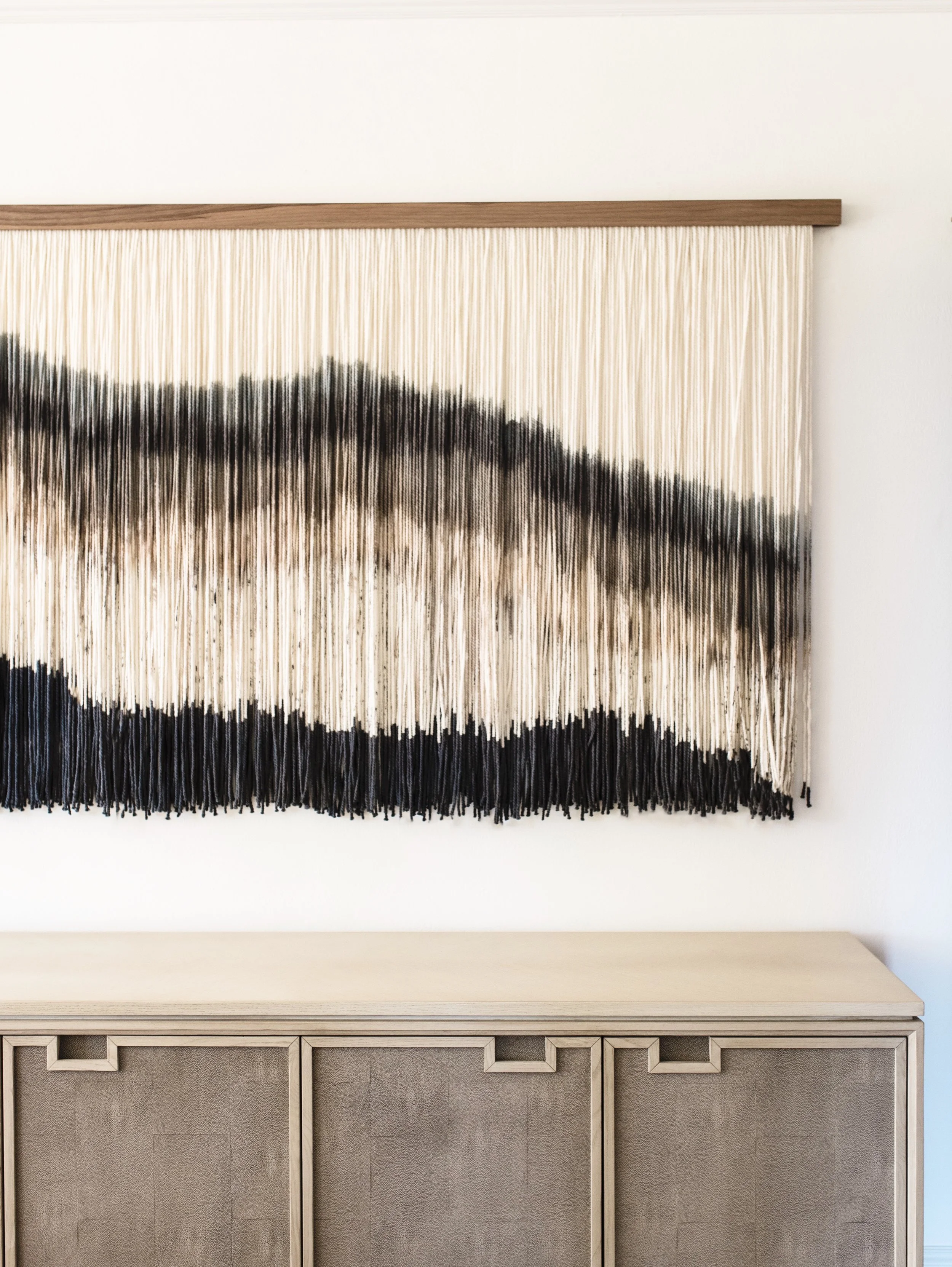
You recently completed a project of a Tudor home in California and included one of Lauren’s textile art pieces in the dining room. Tell us about this project.
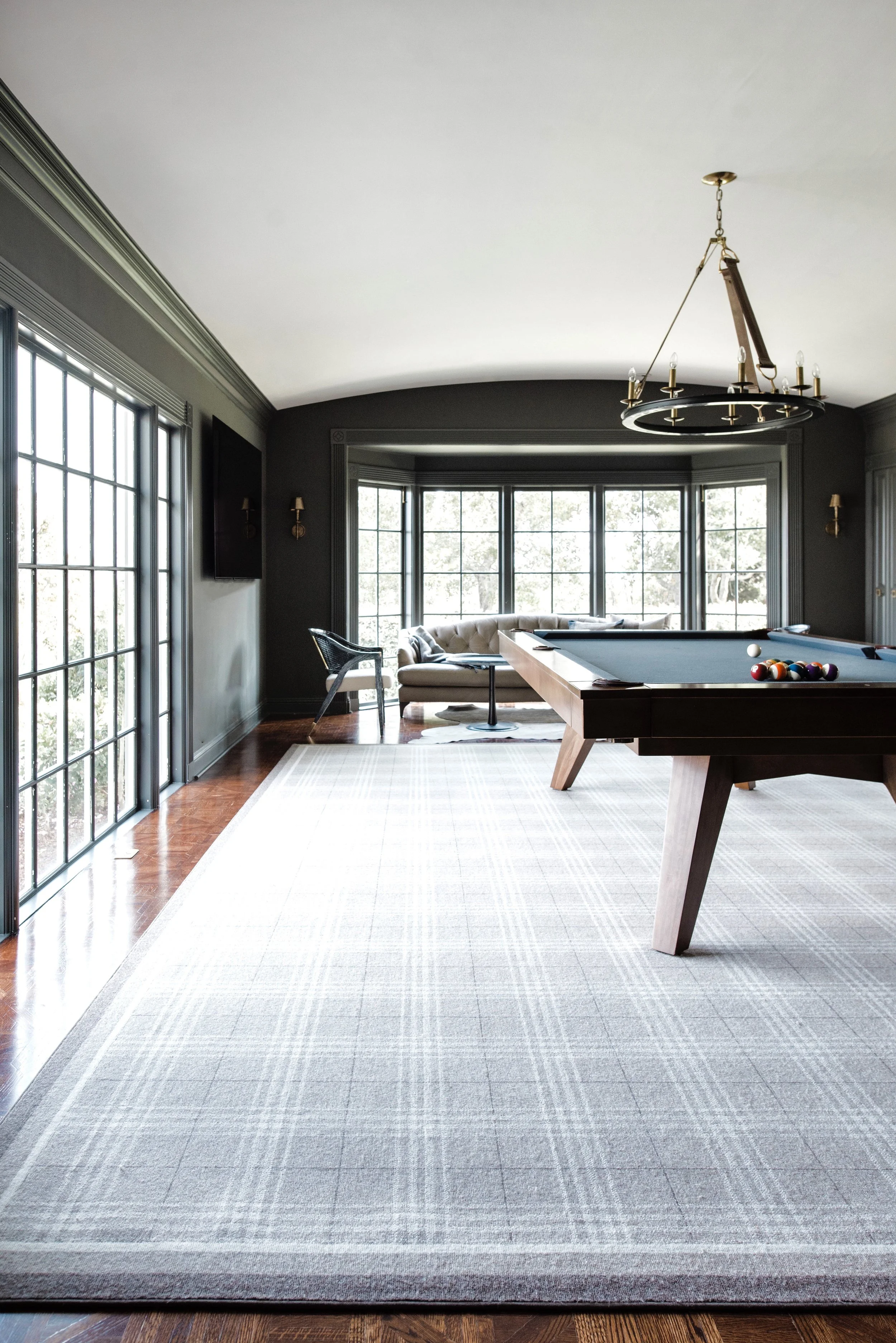
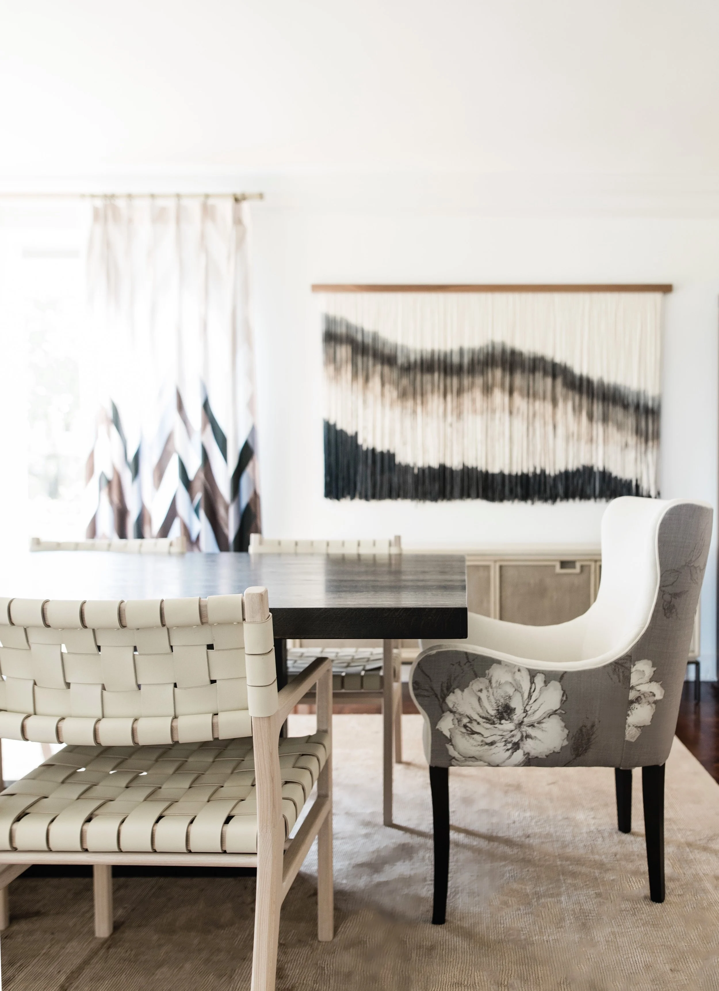
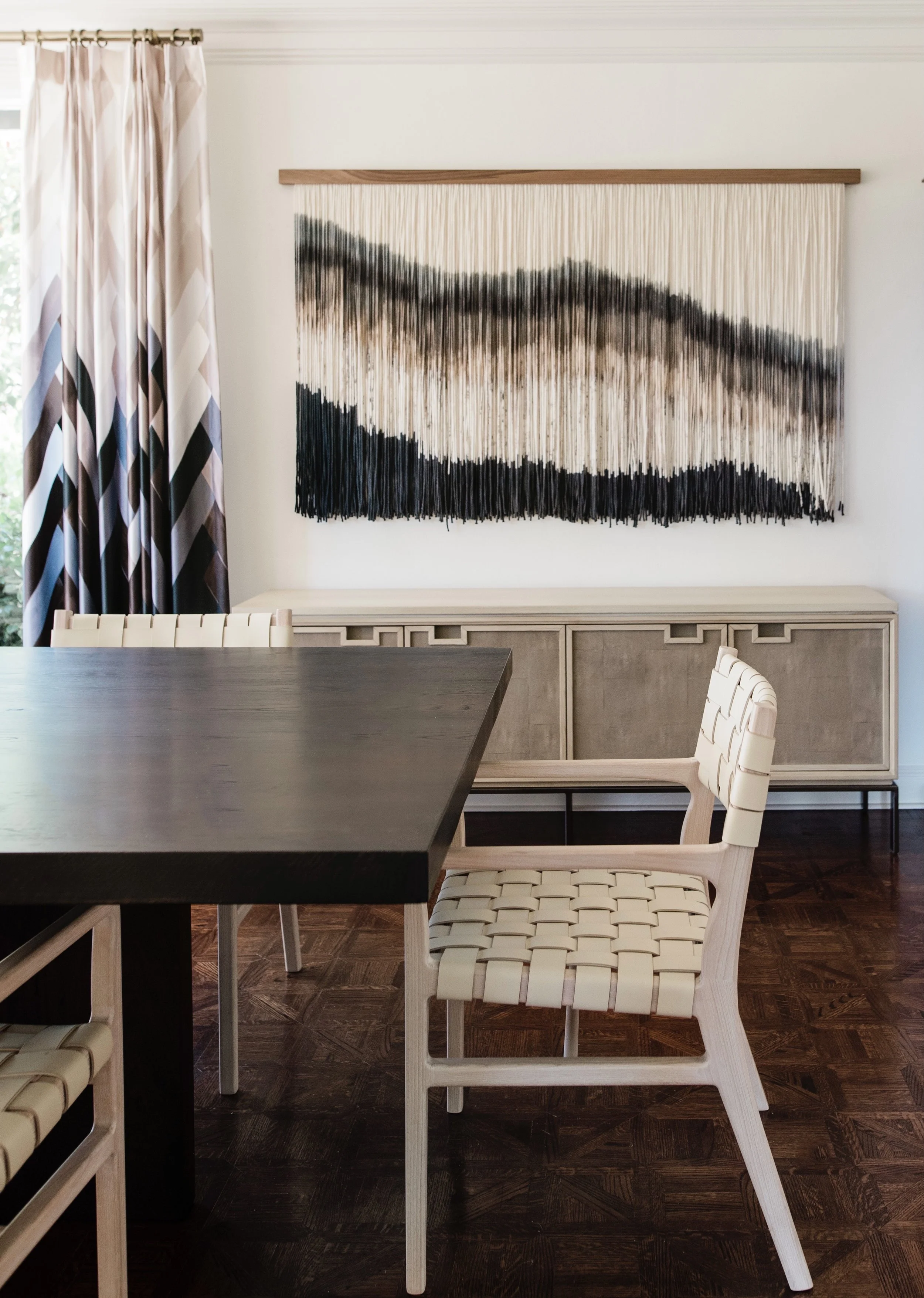
This family of five moved into this traditional Tudor home with hopes to transform it into a space that reflected their family and how they lived. The homeowners wanted to keep the traditional Tudor architecture but give the home a fresh, modern look. It was important to the family that we achieved a casual California, indoor outdoor aesthetic that was elegant but livable. They wanted to be sure that it wasn’t stuffy and they could relax, kick their feet up, and feel at home. We brought modern elements and edgy lighting into each room creating an unexpected but sophisticated aesthetic that was still comfortable and approachable. Lauren’s art was a seamless and natural addition to the overall look and feel we were going for.
Design: Lisa Furtado Interiors // Photo: Madeline Harper
Design: Lisa Furtado Interiors // Photo: Madeline Harper
Design: Lisa Furtado Interiors // Photo: Madeline Harper
Design: Lisa Furtado Interiors // Photo: Madeline Harper
Design: Lisa Furtado Interiors // Photo: Madeline Harper
Design: Lisa Furtado Interiors // Photo: Madeline Harper
Design: Lisa Furtado Interiors // Photo: Madeline Harper
What drew you to Lauren’s artwork for this home?
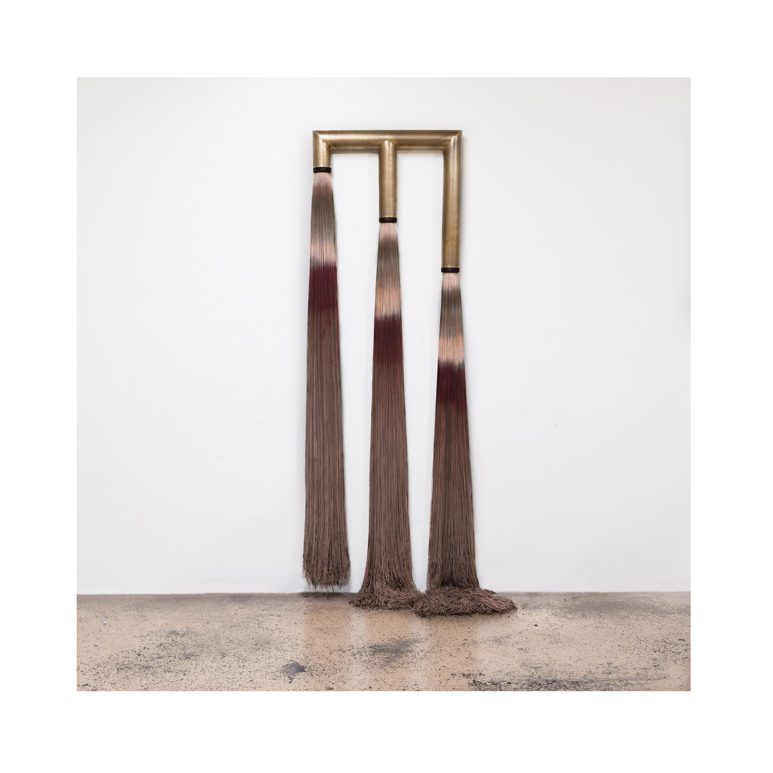
The fluidity and organic nature of Lauren’s pieces lends itself to the informal but sophisticated vibe we were going for on this project. The texture, depth and visual interest that her unique pieces bring to a space is incredible. I feel so fortunate to have had the opportunity to include them in our projects and also in my own home.
How does artwork play into your design process?
Artwork is actually one of the most difficult layers to source for a client because it is so personal. Not only does a piece of art have to coordinate aesthetically into the overall design but it also needs to speak to the clients. Occasionally pieces I think are a great fit don’t resonate with the client and often I am surprised at what pieces clients are drawn to.
Design: Lisa Furtado Interiors // Photo: Madeline Harper
Design: Lisa Furtado Interiors // Photo: Madeline Harper
Design: Lisa Furtado Interiors // Photo: Madeline Harper
Design: Lisa Furtado Interiors // Photo: Madeline Harper
Do you have any upcoming projects you can tell us about?
I have two exciting new builds in Santa Cruz and Sonoma that I’m really looking forward to in 2022!
Design: Lisa Furtado Interiors // Photo: David Duncan Livingston
To see more of Lisa’s work and future projects follow her on Instagram @lisafurtadointeriors and visit her website.
Inspired by Lisa Furtado Interiors?
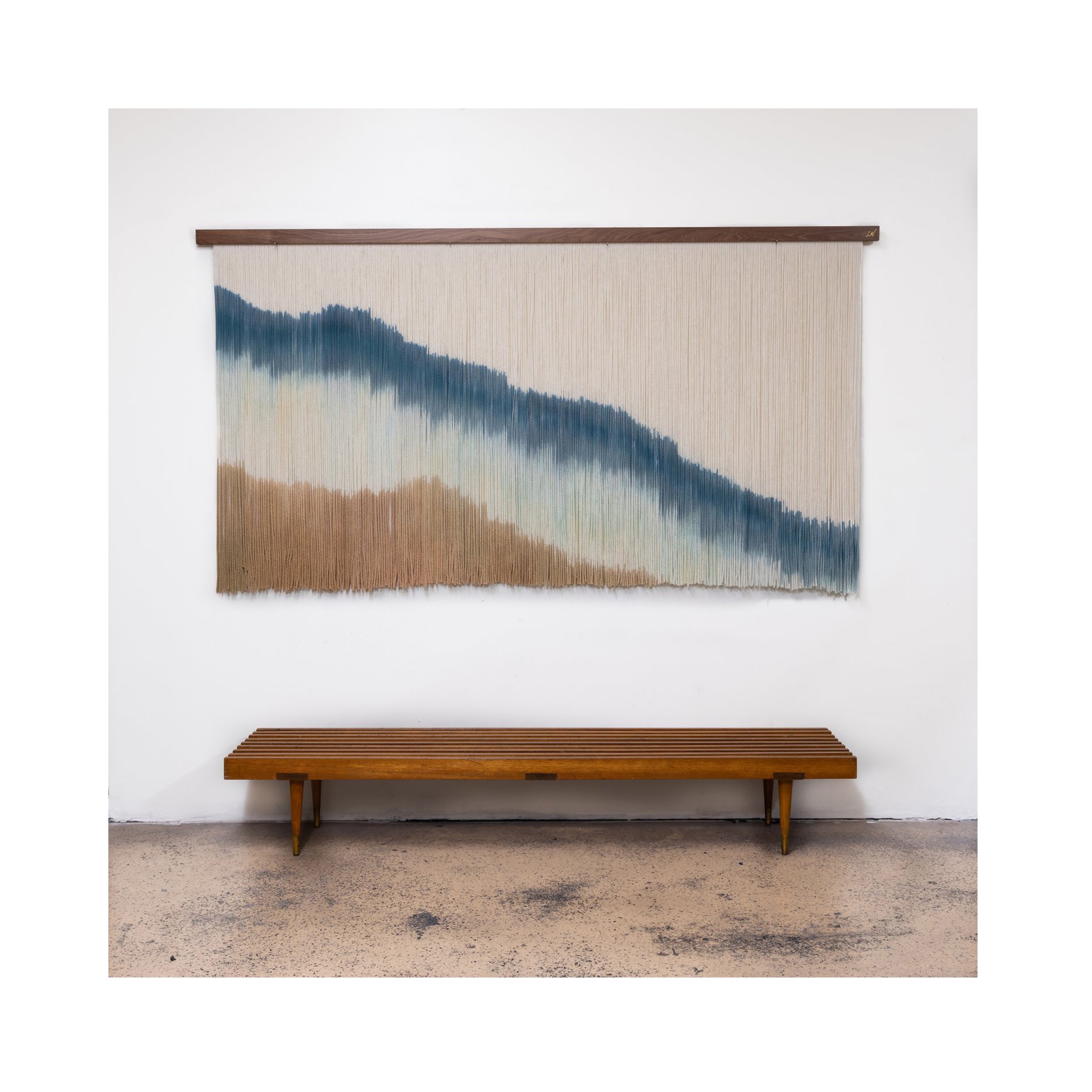
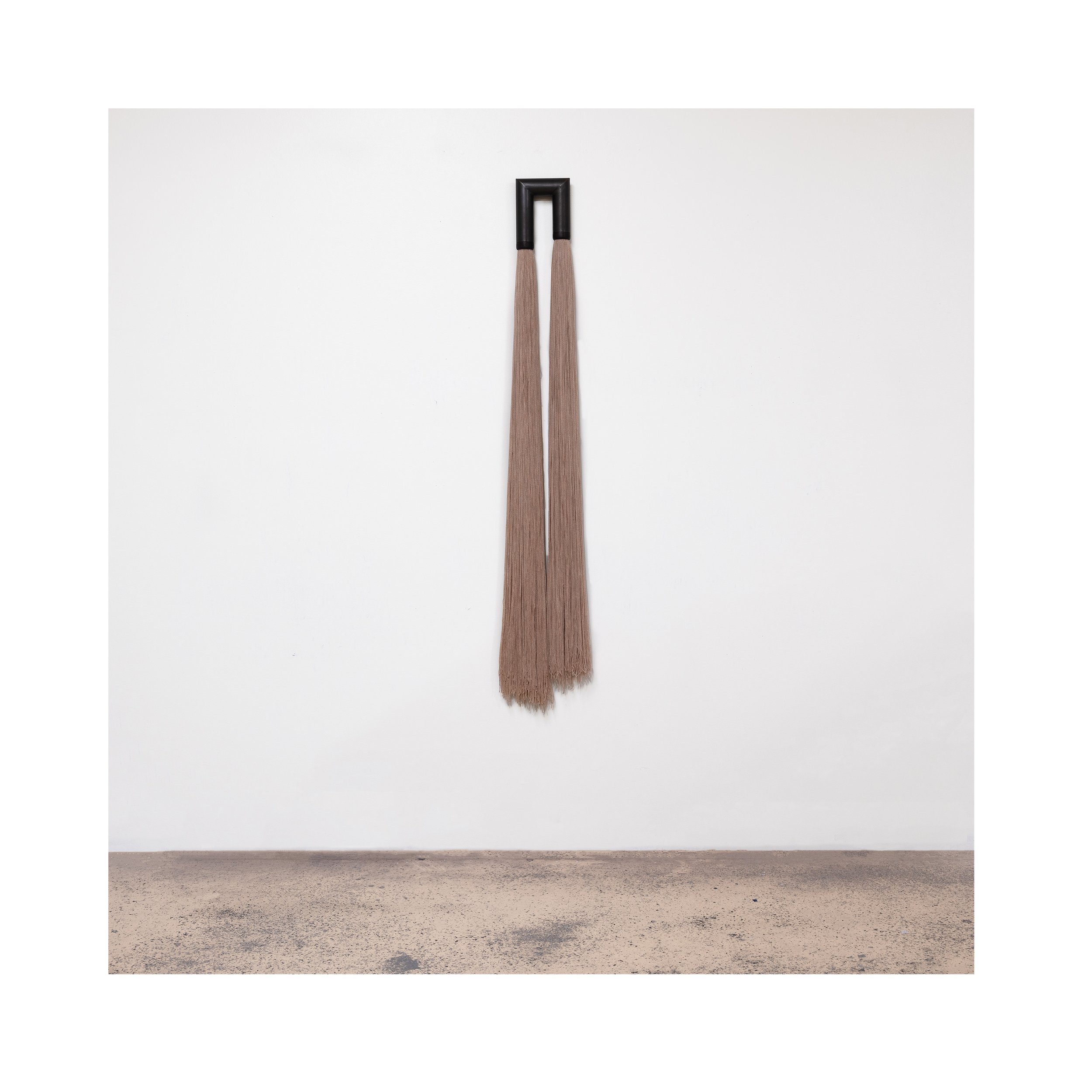
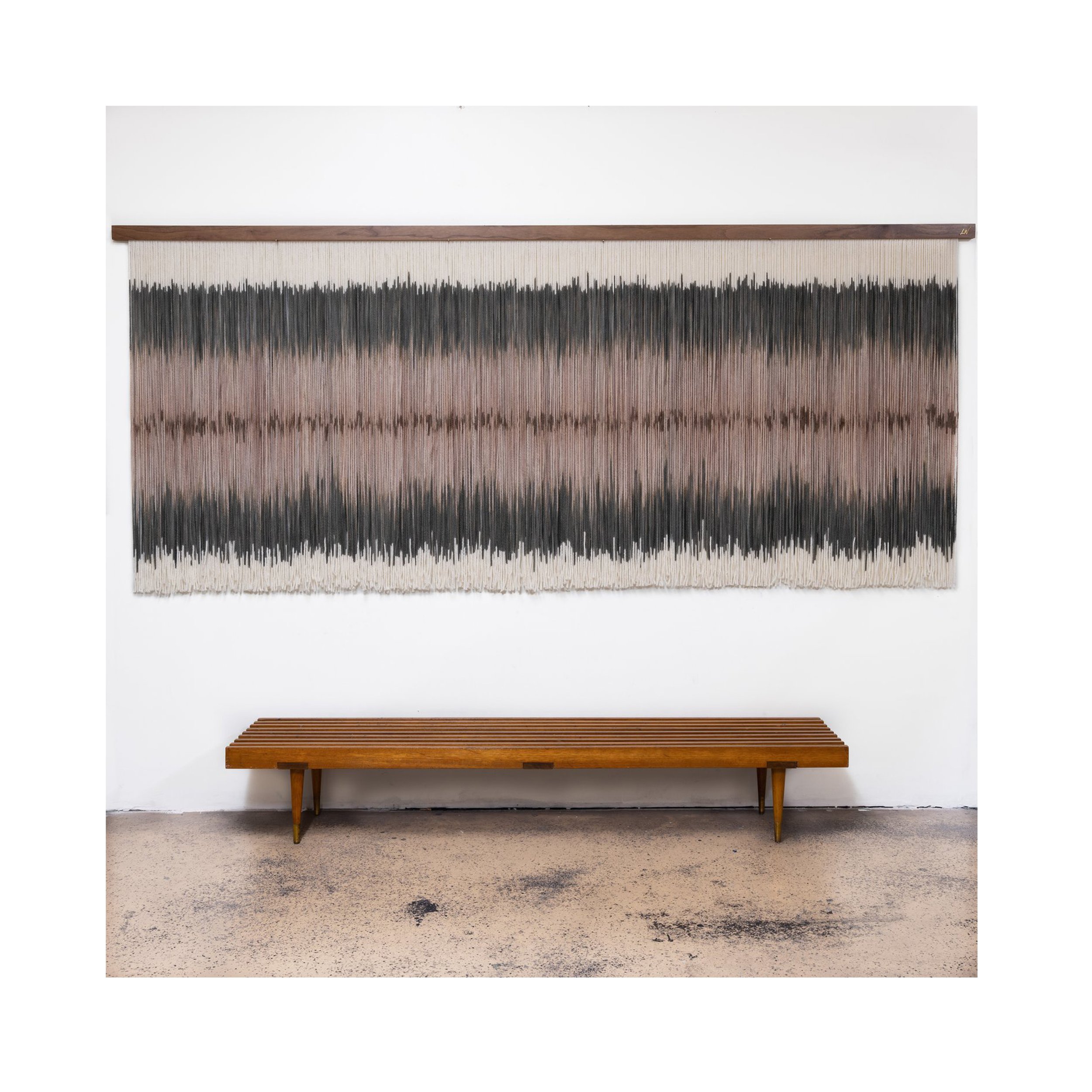
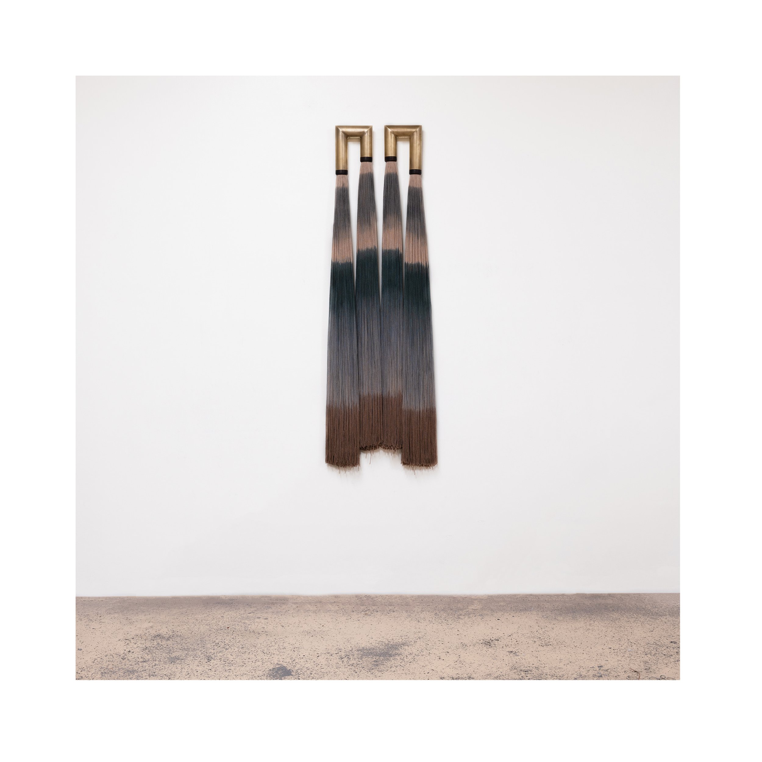
Check out available artwork below

